


In today’s polarized media environment, being able to quickly assess the political slant and reliability of a news source is more valuable than ever. That’s where media bias charts come in. These visual tools map where news outlets fall on the political spectrum and how trustworthy they are, helping readers make more informed choices.
At Biasly, we believe in transparency and clarity. That’s why we developed our own interactive Media Bias Chart — an advanced, AI-powered tool designed to help users of all backgrounds easily identify bias across major media outlets.
In this article, we’ll break down what a media bias chart is, why it matters, what makes Biasly’s chart different (and better), how it works, and how you can use it both individually and in the classroom.
What Is a Media Bias Chart?
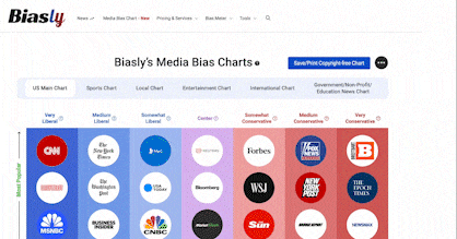
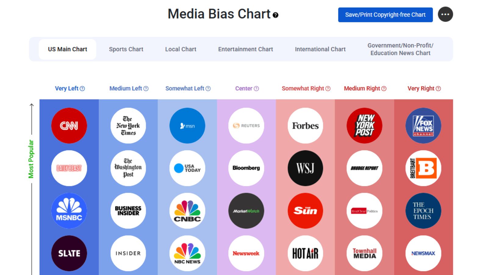
A media bias chart is a visual representation that ranks media outlets based on their political leaning (from very liberal to very conservative) and their content credibility (from low to high reliability). These charts serve as a quick-reference guide to help readers assess where a source might stand ideologically and whether its content can be trusted.
Charts like these are especially useful for students, researchers, and everyday readers who want to:
- Detect media bias more easily
- Compare news coverage across the political spectrum
- Identify high-quality and balanced sources
- Make more informed decisions about the information they consume
Why Biasly’s Media Bias Chart Stands Out
While media bias charts are not a new concept, Biasly’s Media Bias Chart is designed with a few key improvements that set it apart:
1. AI + Human Hybrid Ratings
We combine the best of both worlds: advanced AI algorithms and professional political analysts who verify the ratings. This hybrid model ensures the results are:
- Accurate
- Continuously updated
- Balanced across various political perspectives
2. Multiple Categories for Richer Analysis
Biasly’s chart isn’t limited to political news. It includes specialized tabs for:
- Mainstream News Sources (the core political chart)
- Local News Outlets
- Entertainment Media
- Sports Media
- International Sources
- Opinion-focused Outlets
This categorization allows users to explore bias beyond politics, giving a fuller picture of how media bias manifests across sectors.
3. Free Classroom-Ready Version
Educators can freely download a printable version of the chart that’s designed for classroom use. It’s an ideal resource for lessons on:
- Media literacy
- Political polarization
- News source comparison
- Civic education
The downloadable chart is easy to understand and highly visual, making it perfect for students from middle school to college.
How Biasly Calculates Media Bias and Reliability
Our bias ratings are based on a proprietary methodology that analyzes:
- Word choices and framing in articles
- Sources cited and topics covered
- Tone and sentiment
- Patterns in political language
Biasly’s AI assigns each article a bias score and reliability score, which are then averaged across a sample of articles from the outlet. The results are reviewed by trained analysts to ensure they align with real-world political context and journalistic standards.
This data is then used to place outlets on the Biasly Media Bias Chart according to:
- Political Leaning (Very Liberal to Very Conservative)
- Popularity (Low to High)
We regularly update the scores and include new outlets based on user interest and shifts in media behavior.
Learn more about our Bias Score Analysis.
Key Features of the Biasly Media Bias Chart
1. Interactive & Easy to Navigate
Users can zoom, filter, and hover over outlets to view their specific scores and categories. This makes the chart highly actionable and usable for quick reference.
2. Politician Bias Chart Integration
Biasly doesn’t just rate media outlets — we also offer a Politician Bias Chart that tracks the ideological leanings of individual politicians based on:
- Their voting records
- Public statements
- Policy positions
This adds valuable context for those comparing news source bias with political messaging.
How to Use the Bias Chart for Media Literacy
Educators, journalists, and independent thinkers can use the chart to:
- Teach students how to compare source bias
- Guide media consumption habits
- Create assignments around finding balanced viewpoints
- Visualize media trends over time
It’s also a powerful tool for family discussions, community workshops, and journalism classrooms.
Final Thoughts: Does Media Bias Charts Matter in 2025?
In an era of misinformation and echo chambers, tools like media bias charts provide a simple but powerful way to evaluate what we read and watch. Biasly’s chart goes a step further by blending AI, real-time updates, and cross-category analysis to offer the most reliable media bias rating tool on the market.
Whether you’re an educator, student, or media consumer, this tool empowers you to:
- Spot misinformation
- Understand bias
- Encourage critical thinking
Visit the Biasly Media Bias Chart to explore the chart yourself or request the printable version for your classroom.
Let’s raise a more media-literate generation — one chart at a time.